How did
Massimo Vignelli
strive for
utilitarian design?
“Design is not art.
Design is utilitarian,
art is not.”
— Massimo Vignelli
Introduction
Massimo Vignelli is one of the most celebrated modernist and Swiss style designers of the 20th century (Munari, 2013). Throughout his varied design disciplines, from graphic design to architecture, Vignelli always designed using the strict modernist values of “form follows function” (Vignelli, 2010). Often associated with Vignelli’s reductive and efficient work, is the philosophy of utilitarianism. Defined as “the belief that the right course of action is the one that will produce the greatest happiness of the greatest number of people” (Oxford Dictionary), utilitarianism is at the heart of modernist design. Within design, utilitarianism can be viewed as finding the most efficient and elegant solution to design, which is an idea that Vignelli truly believed in (Vignelli, 2010). In this essay, I want to investigate and explore the ways in which Massimo Vignelli strived for utilitarianism in his design style.
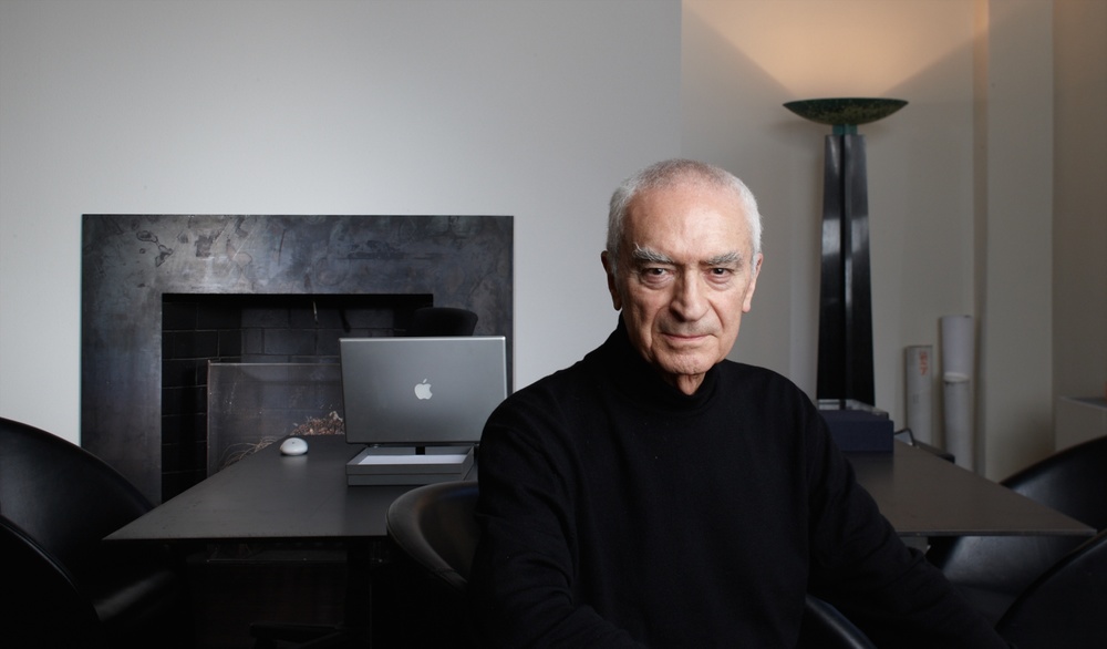
Massimo Vignelli
(1931 — 2014)
Developing Style
To understand the utilitarian style of Vignelli’s design, I believe it is important for me to first look at where this style came from and how it developed in his work. Massimo Vignelli was born in Milan, Italy on the 10th of January 1931. After studying architecture at the University of Venice, Vignelli moved towards other design disciplines, such as graphic and product design, due to the speed of architectural design not suiting his design process. Vignelli moved to Chicago, USA, in 1958 to teach graphic design at the Institute of Design. The illustrative culture of American corporate design in the 1950s inspired Vignelli to reimagine what corporate design could be, thus, when he returned to Italy in 1960, he began his own design firm with his wife, Lella Vignelli, called “The Lella & Massimo Vignelli Office of Design and Architecture”, or “Vignelli Design” (Munari, 2013).
Vignelli’s time in America lead to him beginning to develop his own design style, which is reflected in the work he produced during the four years that Vignelli Design was operating. A notable example that encapsulates Vignelli’s style is his posters for “Piccolo Teatro di Milano”. These playbills are purely typographical and feature simply black, white, and red as the colour scheme (Archivio Grafica Italiana). The text is clear and easy to read with the varying red and black type of different sizes being used to give hierarchy and structure to the information. Vignelli used grids to organise his typography, adding to the structured and balanced feel of the designs (Vignelli, 2007). Ultimately, he has managed to present the information in a clear, easy-to-understand way using purely structure and typography, creating a distinctly utilitarian design style that continues to be seen through Vignelli’s work. It is also important to note that in his work for Piccolo Teatro di Milano, we see Vignelli utilise a typeface that we see again and again in his work; that being, Helvetica.
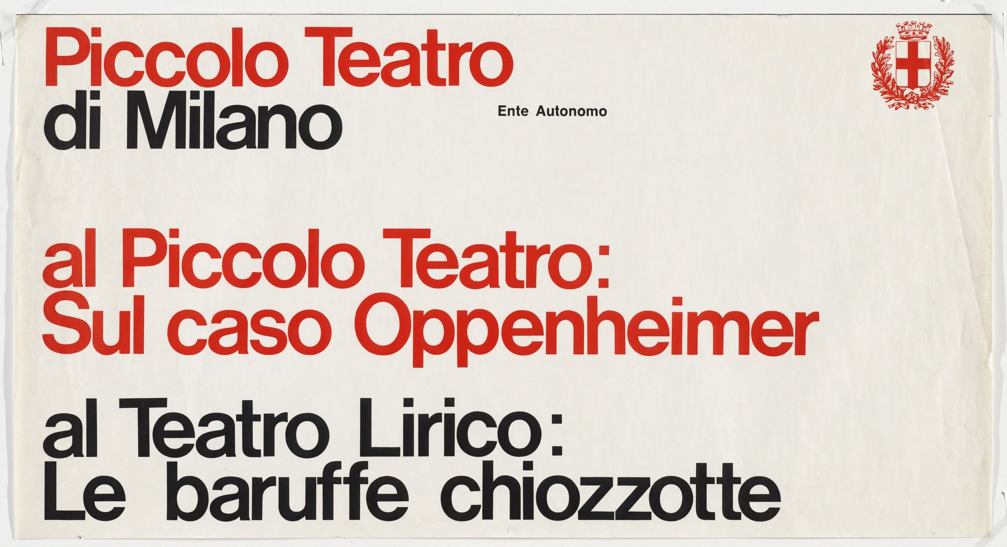
Playbill for
Piccolo Teatro di Milano,
Massimo Vignelli
(1964)
Typography
Typography was an incredibly important part of Massimo Vignelli’s work, with a lot of his work being purely typographically based. Vignelli believed that there were only 6 truly “good” typefaces: Bodoni, Century Expanded, Garamond, Futura, Helvetica, and Times Roman (Vignelli, 2010). This reflected his utilitarian beliefs: each of these typefaces has distinct characteristics while all are very legible, meaning at least one would be usable in any design project. None of the six typefaces is at all overly designed, they are simple and clear designs with distinct qualities, which fits into the ideas of utilitarianism. They are each the most logical and elegant design for what they are trying to accomplish as typefaces, which makes it clear to see why Vignelli held all these typefaces in such high regard.
Of the 6 typefaces previously mentioned, Helvetica was a particular favourite of Vignelli. Particularly the tight shoulders, high x-height, and short ascenders of Helvetica created a compact aesthetic that appealed to Vignelli's utilitarian values. Vignelli believed that Helvetica allowed for an objective and systematic approach to design, rather than an approach based on emotions and personality. Using Helvetica allowed Vignelli to create design work that he believed to be unequivocally utilitarian through the utilisation of Helvetica’s structured and characterless forms. In Vignelli’s mind, to use Helvetica, was to present the text as objectively as possible, with the true meaning of the text not being affected by the personality of the typeface (Vignelli, 2007) Vignelli is widely credited for popularising the use of Helvetica; it can be seen throughout nearly all his most influential work, a lot of which is his corporate design work.
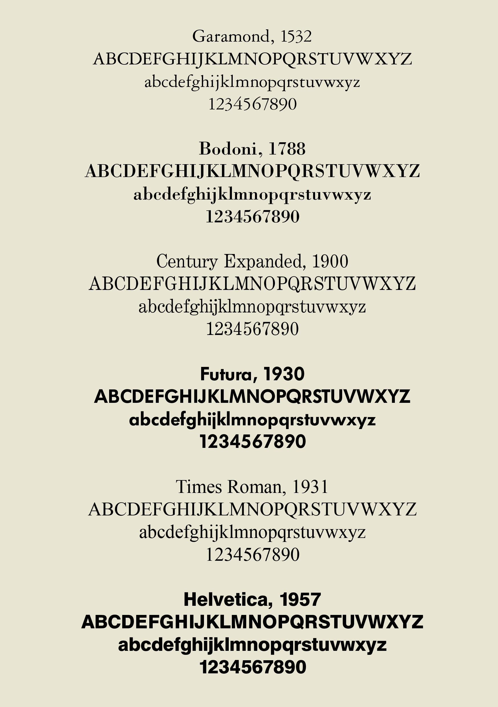
A Few Basic Typefaces,
Massimo Vignelli
(2010)
Corporate Design
When Massimo Vignelli returned to America in 1966, it was to join Unimark International. Unimark was one of the first design consultancies with an international reach, with offices across 3 continents. Vignelli’s role within Unimark was as design director, supervising all work being produced to ensure consistency and visual cohesion. The design work created during Vignelli’s time at Unimark was incredibly influential and shaped corporate design as we know it today (Conradi, 2009).
One of the most important designs produced by Vignelli’s team at Unimark was the corporate identity for American Airlines. The iconic logo features an uncomplicated “American Airlines” in bold Helvetica, above which is a monogram of 2 As surrounding an abstracted image of an eagle. The logo uses a red and blue colour scheme, to mirror the colours of the USA’s national identity. The simplicity of the logo allowed widespread use throughout American Airlines’ corporate identity and showed the viewer the basic but consistent efficiency of the Airline (Bigman, 2014). It is an incredibly elegant solution to corporate design which further demonstrates Vignelli’s prowess for utilitarian design.
What is interesting about the logo is that Vignelli did not want the eagle to be featured in it, believing that if there was to be an eagle in the logo that it should be an accurate form of an eagle . While this may appear to not be a utilitarian idea at first, it is. Vignelli believed that stylising the form of the eagle would take away from its majesty, creating a cartoon of it (Archivio Grafica Italiana). While the design would have been more complex, the importance of the eagle would be better represented, leading to a design which would be more efficient and therefore more utilitarian in Vignelli’s eyes. While in this instance Vignelli believed that the simplification and stylisation of the design were negative for its utilitarianism, there are many other cases where Vignelli utilises this technique to great effect, most notably in his New York City Subway map and signage design.
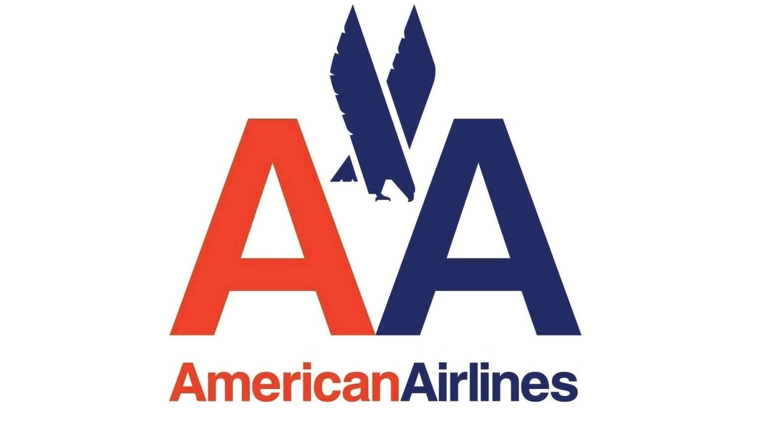
American Airlines Logo,
Massimo Vignelli
(1967)
NYC Subway
Before 1972, the New York City Subway signage was produced by 3 different companies, causing the subway to become a maze of various design styles. The confusion the signage caused led to Unimark International being tasked with creating a new system for navigating the Subway, led by Massimo Vignelli (Lloyd and Ovenden, 2012).
The signage for the Subway is almost entirely typographical, featuring white text on black, with pops of colours used to differentiate between the various lines, creating a design which is distinctively Vignelli. The bold, white, Helvetica type is clear and easy to read, especially on the go which was important due to the chaotic speed of the Subway (Martin, 2021). The colours used to represent the lines allow users to easily identify where they need to go, while also being appealing colours. Together, the typography and colours create a signage system which is easily adaptable to be used in various sizes, overall making it another extremely utilitarian approach to design from Vignelli.
Along with the signage, Vignelli created a modernist navigation system to replace the existing map. Rather than adhering to the true geography of the subway, Vignelli created a design system which would be instantly understandable, using evenly spaced stations on a geometric grid, and train lines of distinct colours which form along the grid. The “dot to dot” (Martin, 2021) system Vignelli designed allowed for ease of reading and navigation, which, in theory, should have worked, however, the inaccurate geography led to confusion from the residents of NYC (Hillery, 2021). The reductive and structured layout of Vignelli’s Subway map was truly utilitarian, being designed for ease of usability instead of focusing on geographical correctness, and while the people of NYC may have disliked it, this was due to human familiarity rather than poor design, which further demonstrates how Vignelli used typography, colour, and form to create utilitarian design.
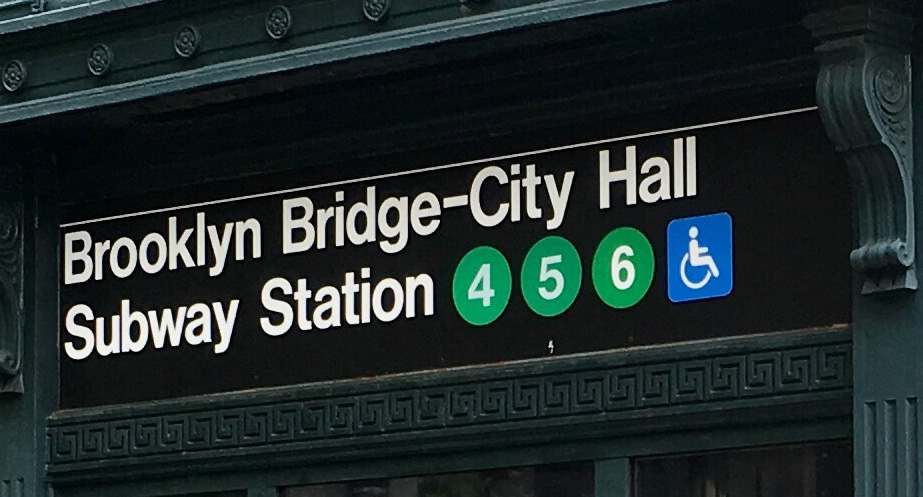
NYC Subway Sign,
Massimo Vignelli
(1972)
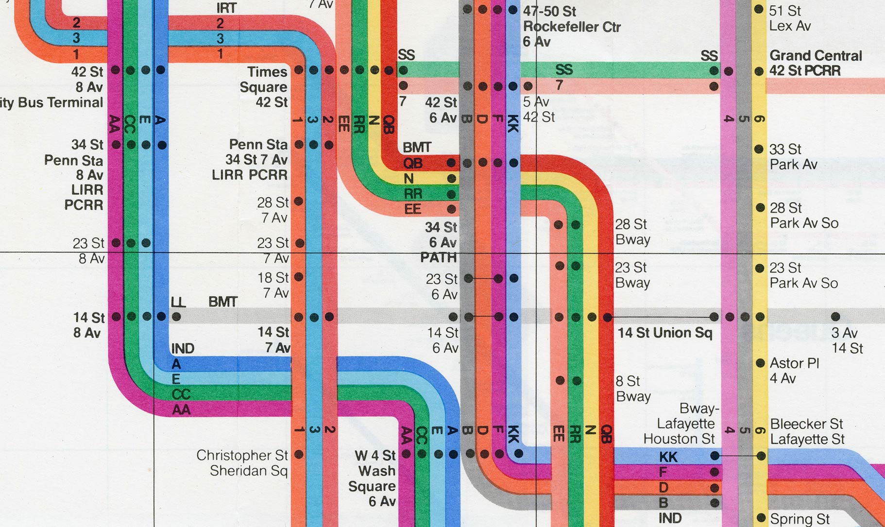
NYC Subway Map,
Massimo Vignelli
(1972)
Conclusion
Throughout my investigation, 3 ways in which Massimo Vignelli strived for utilitarian design kept reoccurring; typography, colour, and form. Each of these were utilised by Vignelli in various ways to create designs which are as effective and efficient as possible while still being appealing to look at and visually interesting. The importance of all 3 cannot be overstated in Vignelli’s work and when examined reveals his genius. For Vignelli, typography had to be clear, legible, and minimally characteristic (Vignelli, 2010); colours had to be used for hierarchical, differential, and meaningful purposes rather than purely for aesthetic value (Vignelli, 2007); and form had to be as simple as possible without detracting from the meaning or purpose (Archivio Grafica Italiana). Vignelli brought all 3 of these philosophies together and used them to form some of the most iconic designs of all time, which were distinctly him, and distinctly utilitarian.